by Jocelyn Netanya Wijaya
An oats brand for children that
encourages them to break all the oat rules.

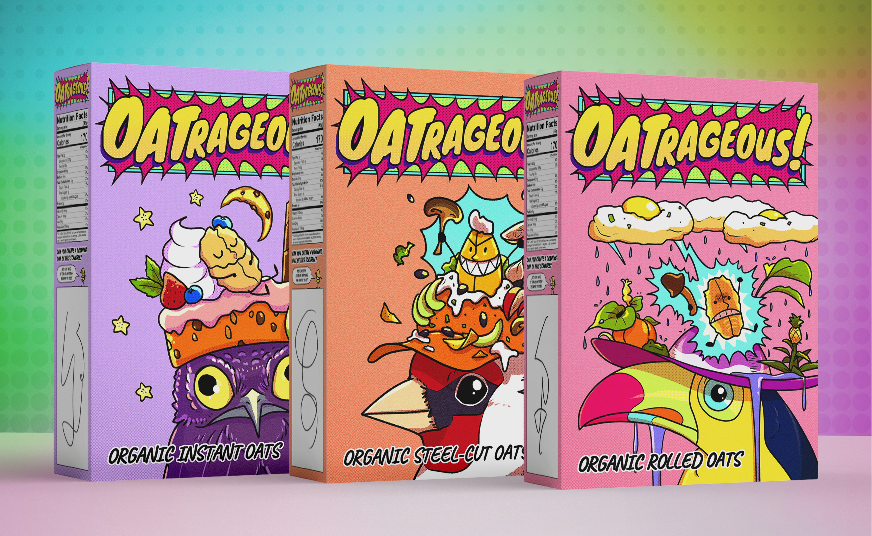
Oats have been pigeonholed: They are known to be paired with ingredients such as sweet and sour fruits, nuts, and condiments like peanut butter or chocolate, especially in the West.
But they don’t have to be! Oats can be paired with whatever ingredient you want, creating any flavour profile that you’d like.
Why not savoury oats? Spicy oats? Herby oats?
Oatrageous! encourages children (and adults!) to be more experimental and try out different ingredients to eat oats with, as well as different methods of cooking oats.
The whimsical, colourful, and comic book-inspired visual style aims to compete with the loud and vibrant branding of sugary cereals aimed at children and present a healthier alternative that is just as fun, and much more versatile.
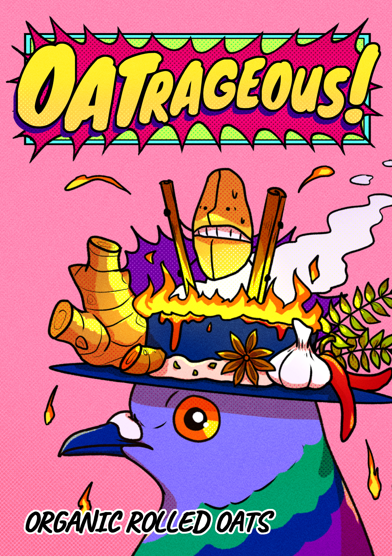


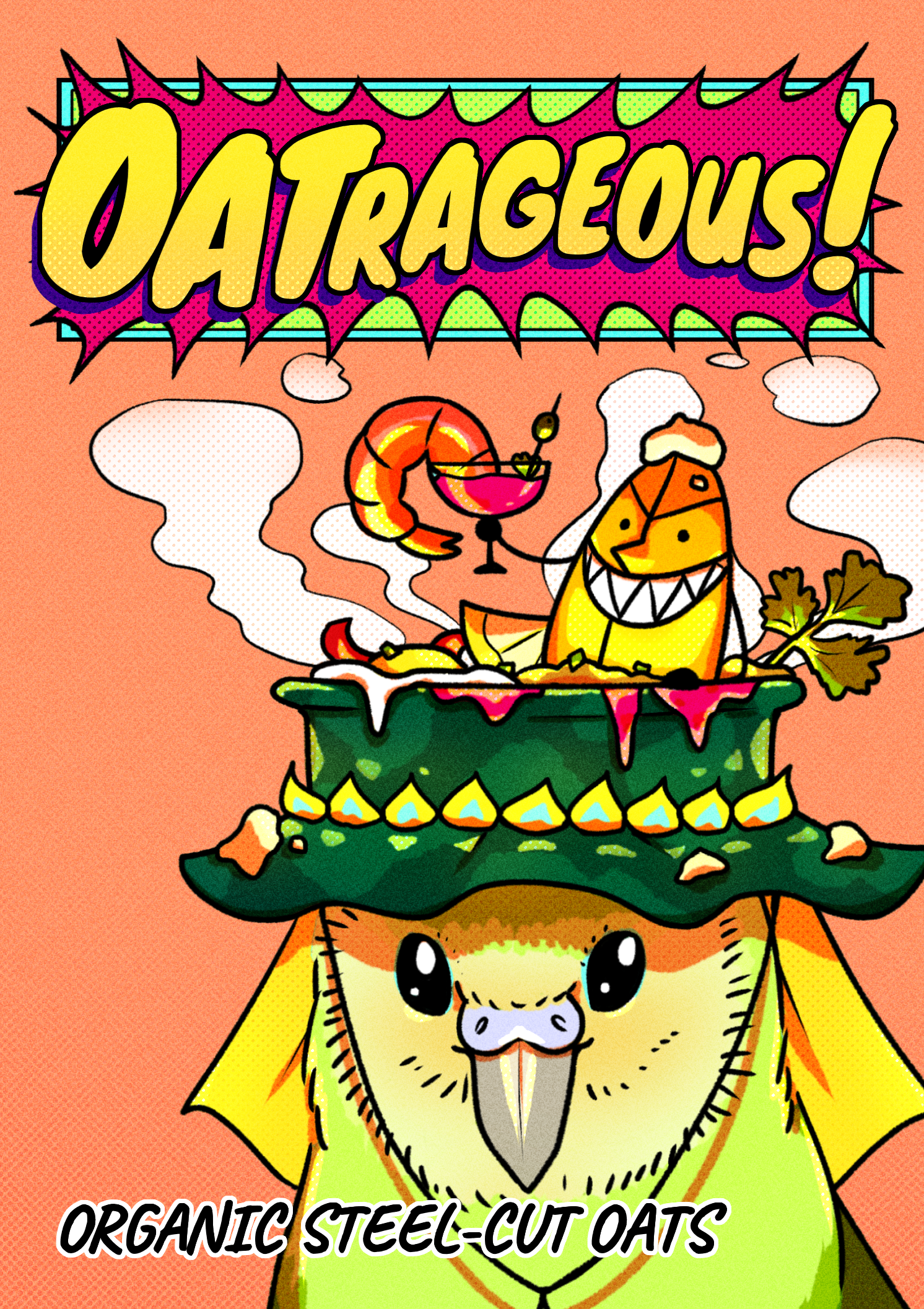
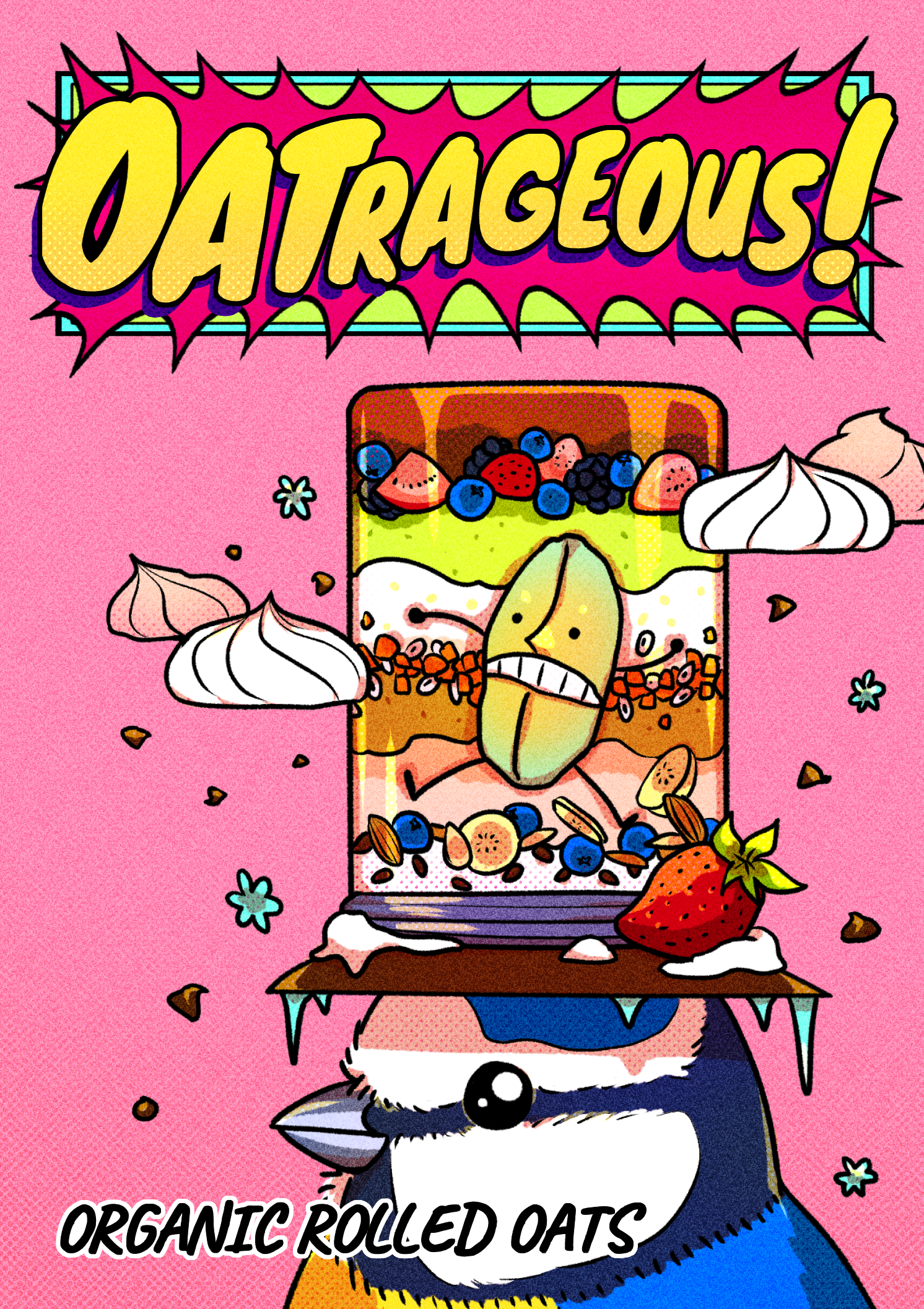
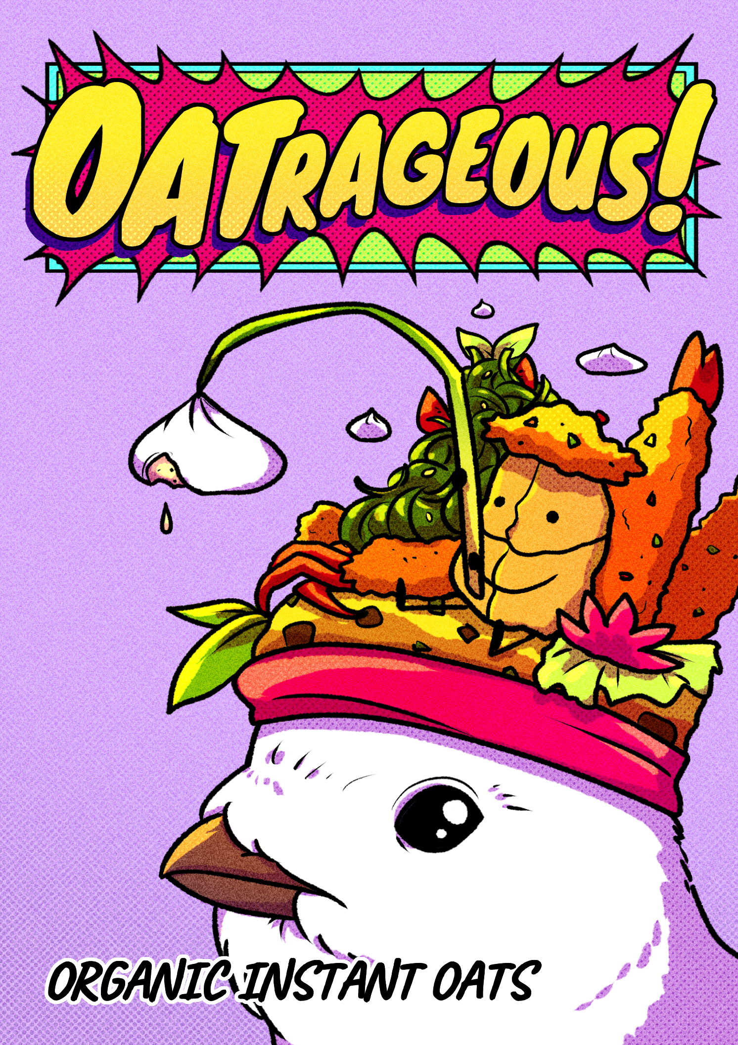


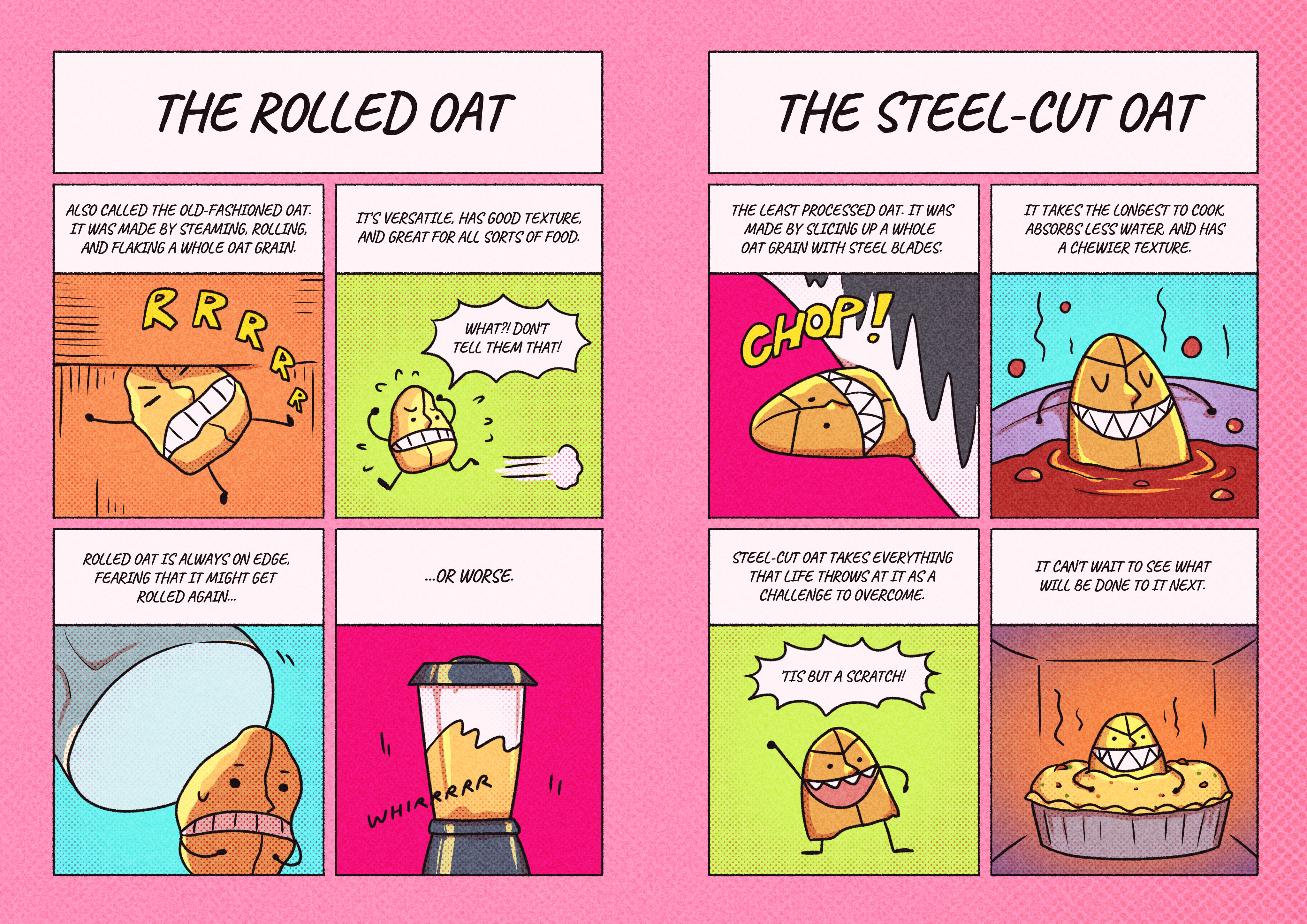
Oatrageous! features three mascots based on the three types of oats sold: The rolled oat, the steel-cut oat, and the instant oat. These mascots have their own distinct personalities and dynamics with each other, and adds a layer of narrative, character-based engagement with the brand.
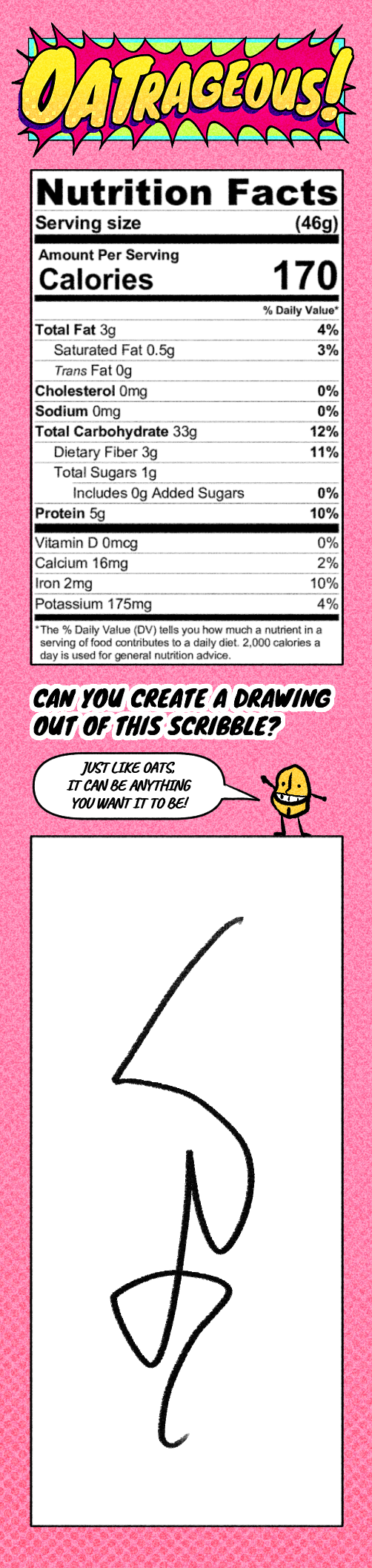
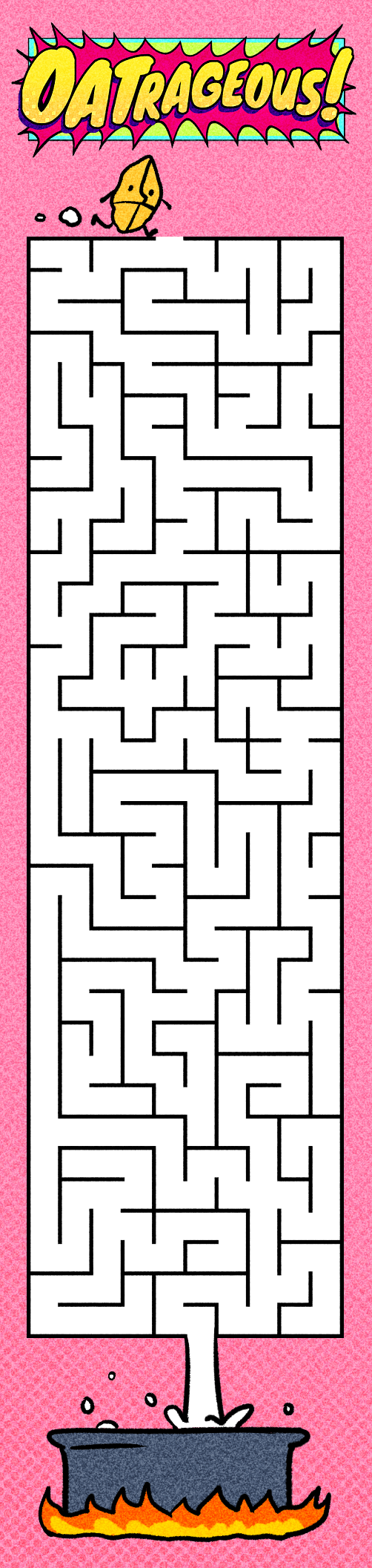
The three oats are constantly at risk of being eaten by a cast of colourful birds, who are out to devour them in all sorts of creative ways. Consumers can gain more insight on these characters through the comic strip on the back of the oats box, which also features an oat recipe that they can try out.

The mascots are also applicable to media outside of the packaging, such as simple 4-page comic books and animated shorts.

Packaging Mock-ups

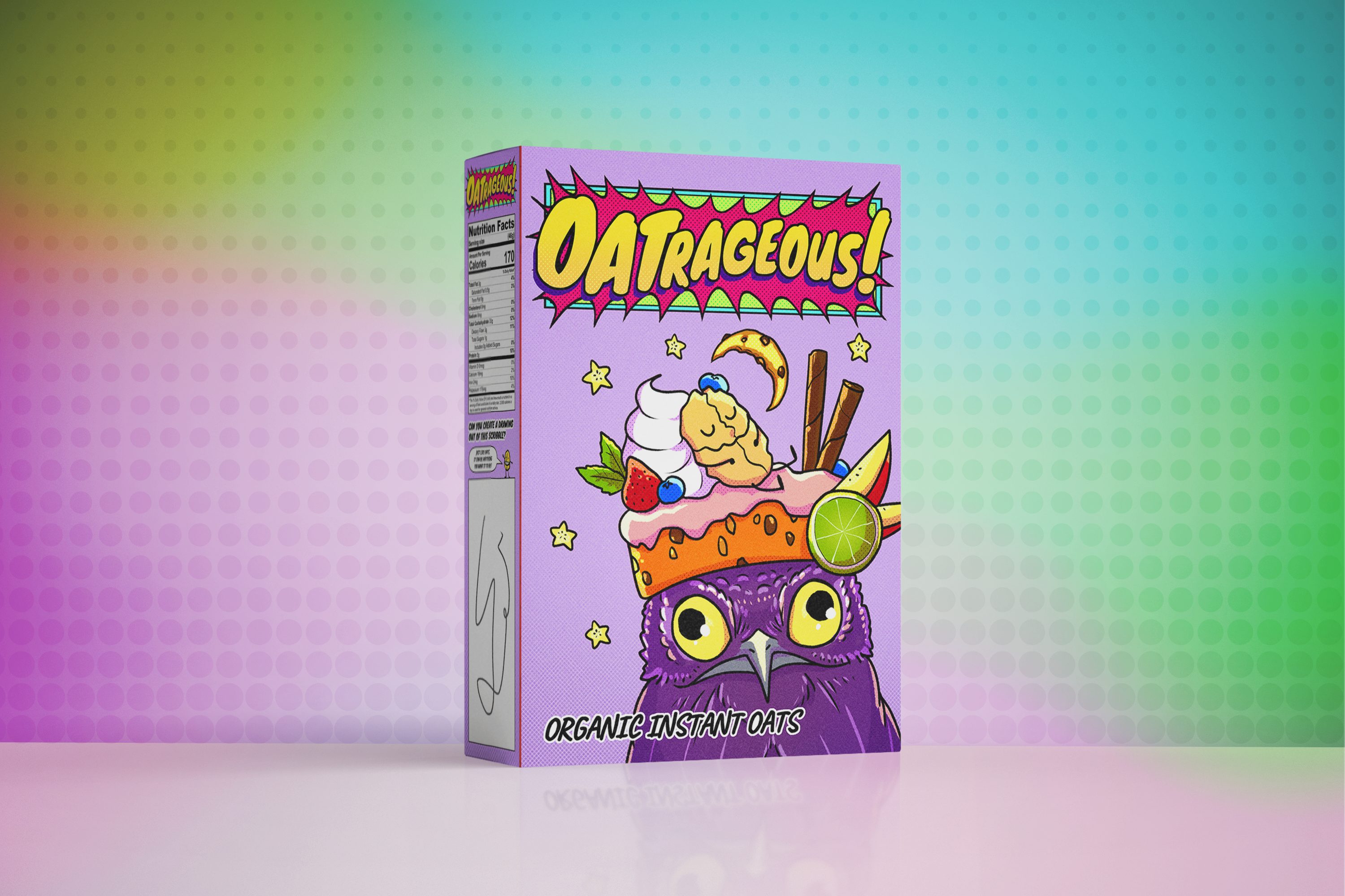


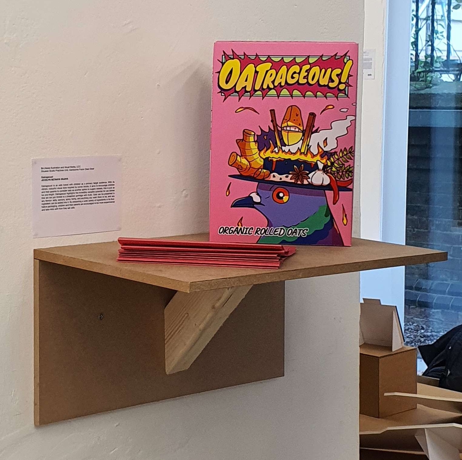
This project was created for a client brief by Handsome Frank to create illustrations for food packaging.